In the fast-paced world of business, staying relevant is key. One of the most powerful ways to do this is through rebranding—an art that Jaguar recently mastered. As a creative studio specializing in bespoke branding, Iris Graphics Ltd recognizes the opportunities and challenges that come with rebranding. Let’s dive into what businesses can learn from Jaguar’s recent transformation.
Why Rebrand?
Rebranding is more than just a facelift; it’s a strategic shift that can rejuvenate a company’s image. Jaguar’s recent rebrand showcases how a legacy brand can keep its heritage while appealing to a modern audience. This move refreshed their visual identity. It also reinforced their commitment to innovation and sustainability. These are values that resonate with today’s consumers.
Key Insights from Jaguar’s Strategy
Embrace Change with Purpose: Jaguar’s rebrand was driven by their transition to an all-electric future. This purposeful change aligned with global sustainability trends, highlighting the importance of aligning rebrand efforts with strategic goals.
Consistency is Crucial: While Jaguar updated its logo and brand look, it maintained consistency in its core values. These values include luxury, performance, and innovation. Consistency across touchpoints ensures that the new brand identity is recognized and trusted by the audience.
Engage Your Audience: Jaguar involved their audience by sharing their rebranding journey through engaging content and narratives. This transparency fostered trust and excitement, crucial elements for a successful rebrand.
Practical Advice for Your Rebranding Journey
Define Your Why: Clearly articulate the purpose behind your rebrand. Is it to modernize your image, reach a new audience, or align with new business goals?
Stay True to Your Roots: While change is essential, guarantee your brand’s core values stay intact. This balance will help keep customer loyalty.
Communicate Effectively: Use storytelling to share your rebrand journey with your audience. Engaging content can create a buzz and foster emotional connections.
Conclusion: Steering Your Brand Forward
Rebranding is a powerful tool to keep your business relevant and competitive. Jaguar’s recent rebrand teaches us the importance of aligning with strategic goals, maintaining consistency, and engaging audiences effectively.
As you consider your own brand’s evolution, let these lessons guide your journey. Ready to revamp your brand identity?
Contact Iris Graphics Ltd for bespoke design solutions that will inspire and empower your business.
Today, we’re delving into the captivating world of branding, the secret sauce that can elevate your business to new heights. Just like a perfectly crafted recipe, branding adds that extra flavor and personality that makes your business stand out in the crowd.
The Recipe for Success
Think of your business as a delectable dish. You’ve got the ingredients – a great product or service, a killer team, and a fantastic work ethic. But what ties it all together?
That’s right, it’s the secret sauce – your branding.
It’s the special blend of colours, logos, fonts, and the overall personality that gives your business a unique and memorable identity.
Stand Out in the Crowd
In the bustling marketplace, where competition is fierce, it’s crucial to stand out. Your brand is your voice, your story. It’s what makes you different from the rest. A strong brand sets you apart, making you instantly recognisable and creating a lasting impression in the minds of your customers.
Build Trust and Loyalty
People are more likely to engage with a brand they recognise and trust. A cohesive and consistent brand builds credibility. When customers know what to expect from you, they feel more confident in their decision to choose your product or service. Trust and loyalty are the foundations of a successful, long-lasting customer relationship.
Create Emotional Connections
Branding is not just about logos and colour schemes; it’s about evoking emotions. A powerful brand creates a connection with your audience, making them feel something. Whether it’s joy, excitement, or trust, these emotions are what keep customers coming back. Your brand becomes a part of their lifestyle, and that’s a recipe for success.
A Picture is Worth a Thousand Words
Now, let’s talk visuals. Incorporating eye-catching images into your branding is like adding the perfect garnish to your dish. It grabs attention, tells a story, and enhances the overall experience. Consider using high-quality images that resonate with your brand’s personality. A mix of product shots, behind-the-scenes glimpses, and customer testimonials can create a visually appealing narrative.
In conclusion, remember that branding is not just a logo; it’s the essence of your business. It’s the secret sauce that makes your venture memorable, trustworthy, and appealing. So, invest in your brand, and watch your business soar to new heights!
Ready to infuse some magic into your business? Contact Iris Graphics. Our team of creative minds will work with you to craft a bespoke brand identity that sets you apart in the market. From logo design to stunning visuals, we’ve got the secret ingredients to make your brand unforgettable. Your success story starts with a click – contact us today!
Let Iris Graphics sprinkle some magic on your brand. Contact us today and let’s create something extraordinary together.
In the vast and vibrant world of branding, colours are the unsung heroes, silently conveying messages and setting the tone for your business. Choosing the right colour for your brand is akin to selecting the perfect ensemble for a grand event – it speaks volumes about who you are and what you stand for. In this guide, we’ll navigate the colour spectrum together and unravel the secrets to finding the perfect hue for your brand, complete with some inspiration from iconic brands.
Understanding the Psychology of Colour
Before diving into the kaleidoscope of colours, it’s crucial to grasp the psychology behind each shade. Colours evoke emotions, and your brand’s palette should align with the feelings you want to evoke in your audience.
Understanding Your Brand’s Personality
Your brand has a personality, and the right colour palette can bring it to life. Are you a playful and youthful brand, or a sophisticated and elegant one?
If you’re a quirky and fun brand, take inspiration from Innocent Drinks’ vibrant use of colours, creating a playful and approachable vibe.
For a sophisticated touch, Burberry’s classic combination of beige, black, and red exudes timeless elegance and luxury.
Consider Your Target Audience
Who are you trying to attract? Your audience’s preferences should heavily influence your colour choices.
The femininity and romance associated with the colour pink are brilliantly embraced by Victoria’s Secret, catering to a predominantly female audience.
The tech giant Apple opts for sleek and minimalist white and silver, appealing to a modern, tech-savvy audience.
Look at Your Competitors (But Stand Out)
While it’s wise to be aware of your industry’s colour trends, strive to stand out. Avoid mimicking competitors too closely, as you risk blending into the background.
In the world of coffee, Starbucks breaks the mould with its iconic green logo, differentiating itself from the sea of browns and beiges.
Test Before You Commit
Before making a final decision, test your colour choices. Create mock-ups and gather feedback from your target audience. Sometimes, a subtle tweak can make a significant impact.
As Instagram evolved, so did its logo. The shift from a retro brown camera to a vibrant gradient of pinks, oranges, and purples reflects the app’s evolution and appeal to a younger, trendier audience.
In Conclusion: Paint Your Brand’s Story
In the canvas of branding, your colour palette is the brushstroke that paints your brand’s story. Consider the emotions you want to evoke, align with your brand’s personality, understand your audience, stand out from competitors, and test your choices. With these principles in mind, you’ll craft a visual identity that not only speaks to your audience but leaves a lasting impression in the colourful tapestry of the business world.
We offer three distinct branding packages for you to choose from, but we can always create one tailored to your needs.
Embroidery and DTF (Direct to Film) print are two different methods of applying designs to fabric. Embroidery is a traditional method that involves using a needle and thread to create stitches that form the desired design. DTF print is a newer method that involves using a heat press to transfer an image onto fabric.
There are pros and cons to both methods. Embroidery is more durable than DTF print and can withstand more wear and tear. However, it is also more expensive and time-consuming to produce. DTF print is less expensive and faster to produce than embroidery, but it is not as durable.
The best option for you will depend on your specific needs and budget. If you need a durable design that will last for years, embroidery is the best option. If you need a less expensive and faster option, DTF print is a good choice.
If you are looking for a durable and long-lasting decoration, embroidery is the best option. However, if you are on a budget or need a quick turnaround time, DTF print may be a better choice.
Here is a table summarizing the key differences between embroidery and DTF print:
Feature
Embroidery
DTF Print
Durability
Very durable
Not as durable as embroidery
Cost
More expensive
Less expensive
Production time
Longer
Shorter
Suitable fabrics
A variety of fabrics
Some fabrics only
Suitable designs
Intricate designs
Simple designs
Washability
Can be washed and dried without fading or cracking
Can be washed and dried without fading or cracking
Sharp details
Sharp details possible
Difficult to get sharp details
Ultimately, the best way to decide which method is right for you is to consider your specific needs and budget.
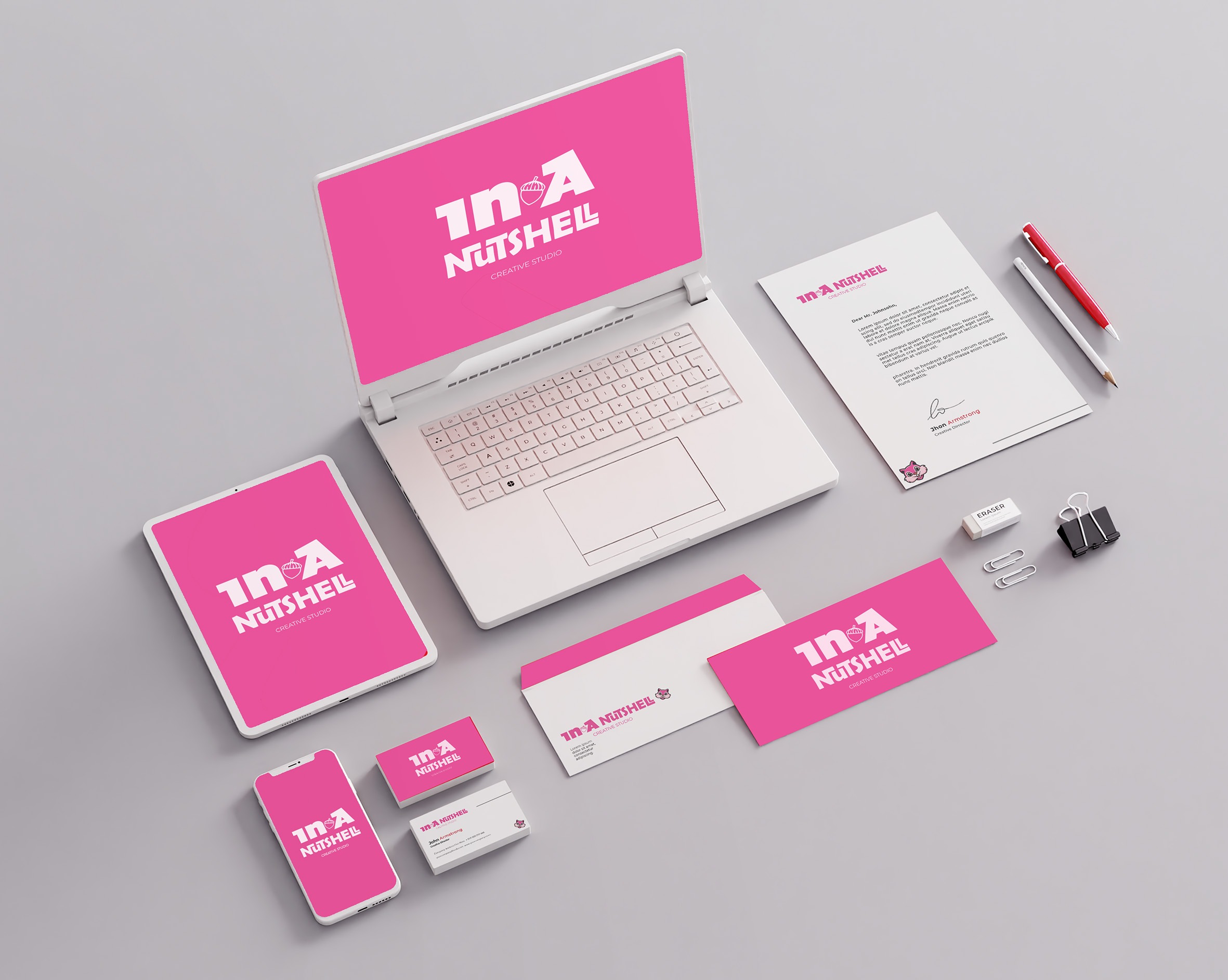
Brand identity is the visual and verbal identity of a company or product. It is what makes a brand unique and recognizable. Brand identity is created through a variety of elements, including the company’s name, logo, tagline, color palette, typeface, and overall design aesthetic. It is also shaped by the company’s tone of voice, values, and culture.
Why is Brand Identity Important?
Brand identity is important because it helps businesses connect with their target audiences. A strong brand identity can help businesses build trust, loyalty, and advocacy among their customers. It can also help businesses stand out from their competitors and attract new customers.
How to Create a Strong Brand Identity
There are a few key steps to creating a strong brand identity:
Define your target audience. Who are you trying to reach with your brand? What are their needs and wants?
Develop your brand values. What are the core beliefs and principles that your brand stands for?
Create a unique selling proposition (USP). What makes your brand different from the competition?
Develop your brand identity toolkit. This includes your logo, tagline, color palette, typeface, and design aesthetic.
Be consistent. Your brand identity should be consistent across all channels, including your website, marketing materials, and social media.
Tips for Maintaining a Strong Brand Identity
Once you have created a strong brand identity, it is important to maintain it. Here are a few tips:
Be consistent. As mentioned above, your brand identity should be consistent across all channels. This means using the same logo, tagline, color palette, typeface, and design aesthetic everywhere your brand is represented.
Be authentic. Your brand identity should be authentic to your company’s values and culture. Don’t try to be something you’re not.
Be responsive. As your company grows and evolves, your brand identity may need to evolve as well. Be open to making changes as needed.
Brand identity is an important part of any business’s marketing strategy. By taking the time to create a strong brand identity, businesses can connect with their target audiences, build trust and loyalty, and stand out from their competitors.
Whether you are setting up a new business or need to refresh your existing branding, at Iris Graphics we offer complete branding packages to cover all your needs
As a Graphic Designer my life has always been full of colour and I have never thought about colour-blindness before, until I met my partner. I could not completely understand at first how he could understand the colours.
So I started doing a bit of research to get a better understanding of what colour-blindness is and I started thinking more of what colours to use in my designs to make in order to avoid colour blindness pitfalls
Colour blindness is a vision deficiency that affects a large number of people around the world. Whether we know it or not, we as designers have a great impact on their daily lives through the work that we create and put out all around us. That being the case, I believe that we should take a few moments and explore some simple yet effective solutions that could help improve their situation and thus the quality of their lives.
What Is Color? A Brief Definition
Before we can completely understand what color blindness is, we should first take a couple of moments and talk about colour, what it is, and how it behaves.
According to Google, the noun colour is defined as:
“the property possessed by an object of producing different sensations on the eye as a result of the way it reflects or emits light”.
Now, light itself is made out of multiple colours that have different wavelengths, where red is the longest one that humans can see, while violet is the shortest.
We know this since in 1666 Sir Isaac Newton put together a little experiment in which he took a beam of white sunlight and passed it through a glass prism. What he observed must have been incredible at that moment since the prism split the beam into a band of seven composing colors which he called the “spectrum”. The order of these colors from the lower end of the spectrum is violet (V), indigo (I), blue (B), green (G), yellow (Y), orange (O), and red (R)—which we now call ROYGBIV.
How Do Our Eyes “See” Colour?
Depending on its physical properties (light absorption, emission spectra, etc.), an object can individually reflect or absorb these seven colors more or less, giving it the property that we call color.
So when we say we see a specific colour, we actually see the amount of colour reflected by the surface of an object when it’s being hit by a light source. When an object reflects all the wavelengths, we see it as being white; when it absorbs them all, it is black.
What Is Colour Blindness?
We now have a basic idea of what color is, but what is color blindness?
Well, many people think that being color blind means you see the world in black and white, but that’s not actually true.
As the online version of the Medical Dictionary points out, color blindness is:
“an abnormal condition characterized by the inability to clearly distinguish different colors of the spectrum”.
A person that is color blind is usually born with this condition, which is determined by a faulty gene found within the X chromosome.
Colour Blind Awarenessstates that the condition affects approximately 1 in every 12 men (8%) and 1 in every 200 women around the world.
How Do You Know If You’re Colour Blind?
If you want to make sure that your eyes are functioning correctly, you should always go visit an optometrist. But the image below will give you a hint to identify if you are colour blind or not.
If you see the number 74 in the image on the right, you’re in the clear.
If you see a 21 (or nothing), then I’ve got some bad news for you: you are red-green color blind.
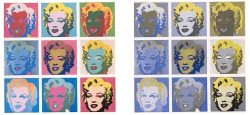
It is important to understand that colour blindness does not equate seeing in black and white. That is monochromacy, which is extremely rare. In fact, colour blindness typically refers to a reduced ability to distinguish between shades of certain colours — most commonly reds and greens; less commonly, blues and yellows.
These colours tend to blend into one another, resulting in perceptions that may look something like this:
The left version of Andy Warhol’s Marilyn Monroe grid has normal coloration; the right version is adjusted to mirror how a red-green color blind person might see it
You’re not colour blind, but you still need to consider a colour blind audience
As a normally sighted person, it’s hard to imagine what my work is going to look like to a colour blind eye. And yet, this can make a tremendous impact.
You wouldn’t want your logo to consist of colours that are clashing or indistinguishable to a colour blind audience, either, would you? Or worse, a logo that is entirely invisible — as with some of the ones below:
These were apparently logos for 1) Bill Gardner, 2) Dennis Murphy, 3) Razoo and 4) Crema Cafe. None of them carries a particularly positive association for a color blind viewer, but 2 and 3 are difficult or even impossible to read!
Conclusion
Whether we realize it or not, colour blindness is a condition that affects a large number of people out there, making their daily lives harder by limiting the things they can see and understand through the filter of color.
Luckily, there are several things that we as designers can do in order to improve the quality of their life, thus making things a little easier one step at a time.
I really hope you, either as a designer or business owner found it useful and opened your eyes to an area of design that is often overlooked.
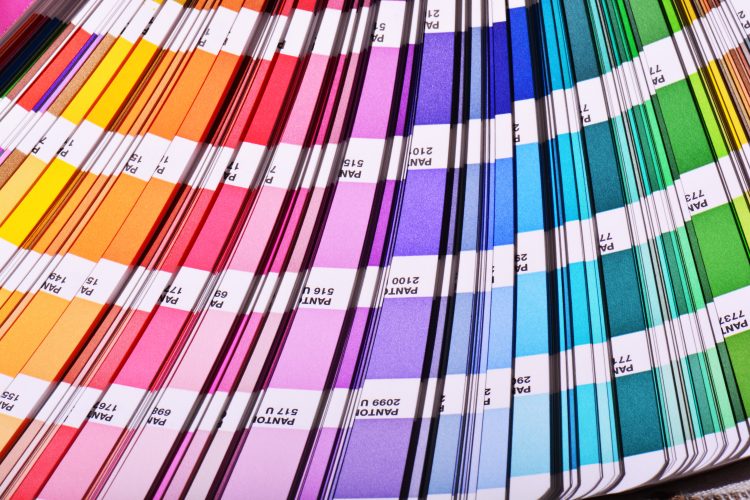
Pantone colours are a widely used colour system when it comes to industrial printing and especially printing on boats, cars, and other objects that want to get more specific colours printed on the surface.
The reason why Pantone colours are called it is that the Pantone colours were made by a company called Pantone, and it was also this company that invented the Pantone Matching System. The Pantone Matching System was made so designers, companies, and other interested parties could be sure that the colour they chose would be the same on all of their platforms. This means that when people refer to a Pantone colour it is the colour that are specified in the Pantone Matching System, so the Pantone system is primarilly made to make it easy for designers to communicate with each other.
How does Pantone colour codes work?
When making a design or print file using Pantone colours to know the code of the Pantone colour you wish to have in your design. The system for printing the ink on paper is referred to using a three- or four-digit number followed by C or U. This refers to colours that can be used on paper which is coated/glossy paper, and U, of course, refers to paper that is uncoated. There are also some Pantone colours which are referred to by the named colours such as the 18 base colours like Pantone Reflex Blue C.
CMYK vs Pantone colours
Printing agencies will often have the possibility of choosing between using Pantone and CMYK colours, and there are primarily two things they take into consideration. The first one and probably the most important one is how specific the colours can be because CMYK colours can only show 70% of all the colours that are visible to the human eye, where Pantone colours can show a lot more colours and especially bright colours. The second thing is how many colours needs to be printed in the design because CMYK uses 4 base colours to create a wide spectrum of colours and you’ll be able to choose as many of these colours without any additional cost. But with Pantone colours the colours are mixed individually and you would then pay for each colour you choose to have in the design.
Where are Pantone colours used?
As written at the start Pantone colours are primarilly used for printing on transport vehicles, such as trucks, boats, and etc. It is though also used for printing on packaging, textile and other products which are not plain and easy to print on. This is due to the Pantone colours not being mixed when they are being put on the product, but the colours have been mixed before it touches which makes them more specific.
Some manufacturers do also use Pantone colours to keep the cost of the printing low by choosing to only print one colour, whereas with CMYK Colours the manufacturers would always be able to print more many colours in the print, so the start-up cost would be higher.
In today’s digital era. You might think that business cards are no longer needed. Think again. Business cards are a proven way to market oneself.
And with borders and restrictions easing up, face-to-face is starting to become the new norm. Thus, let’s meet new clients through your business card.
Let’s get into the excellent stuff to help you design the best business card.
Business Card Dimensions
A business card is what it is because of the universal knowledge of its function and size. It’s a strong marketing tool to reach your market.
The standard size for all business cards is 85 × 55 mm. However, there are other types of card dimensions you can choose.
Around eight other business card dimensions can be used for your business:
Folded Business Card – 88.9 x 101.6mm or double the size of your business card.
Jumbo Square – 88.9 x 88.9 mm
Square – 65 x 65 mm
Mini Square – 50.8 x 50.8 mm
Mini – 70 x 28 mm
Slim – 88.9 x 25.4 mm
You can choose which one is the best for you. You’d also need to finalize your design and what other aspects of the business card are needed.
Why are business cards still important?
There are many reasons why business cards are still important pieces of marketing.
Your business card will be the first impression many potential customers will have of your brand, your business and of you.
Business cards are extremely effective marketing tools. A good business card will rarely get discarded and that means it is still working for you weeks or months after it’s been given and received.
Business cards are much more personal than email or online marketing. A handshake and exchange of business cards creates a much greater impact than any online correspondence and that’s great for building lasting business relationships.
Business cards show you’re a professional and serious about your business. If someone asks for a card and you can’t produce you’ll look amateurish and unprepared to do business.
Good business cards get shown to others and shared between contacts and colleagues. A clever, creative, well-designed and professionally printed business card is a great way to get referrals.
Business cards are great value for money marketing. Business cards are effective and easy to produce at little cost compared to other forms or marketing.
What makes a business card effective?
Business cards are versatile and can be used anywhere. Carry them with you wherever you go. You’ll be surprised at how many opportunities you’ll have to give out cards at social as well as business events like trade shows, conferences, meetings and networking events. They’re so small people will always put them in their pocket and keep them for future reference. There really are no rules on how to use business cards. Be as inventive as you can. Business cards are a great way to get remembered.
Ready to get down to business?
When you’re ready to print your new business cards you can get a quote, by contacting us. When you ask for a quote please let us know if you have special size and/or paper requirements for your business cards. Our print quality is guaranteed.